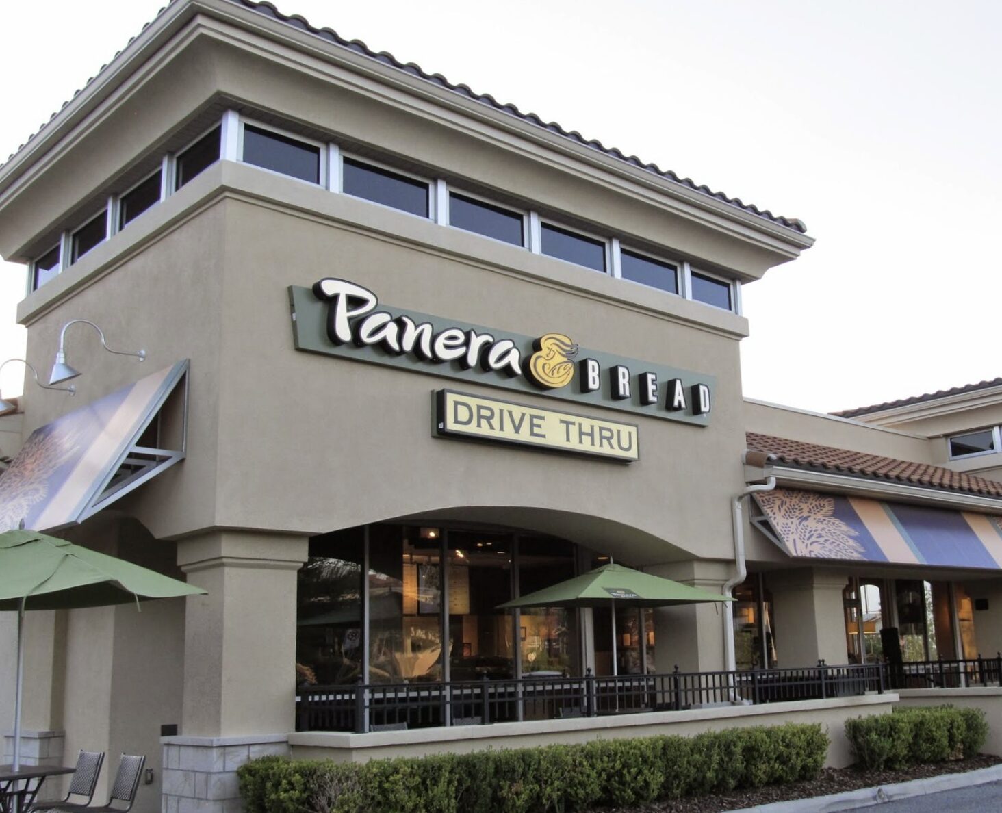
Panera’s logo has evolved since its origins as The St. Louis Bread Company in 1987, but one element remains
constant: the woman holding a loaf of bread. This iconic image reflects warmth and care—core values of the brand

In the latest update, the woman now faces forward, offering a more personal and inviting touch. Behind her, a green semi-circle
symbolizes both the mouth of an oven and Panera’s use of natural ingredients, reinforcing the brand’s focus on freshness
and quality. It’s more than just a logo—it’s a visual story of comfort, tradition, and thoughtful evolution


